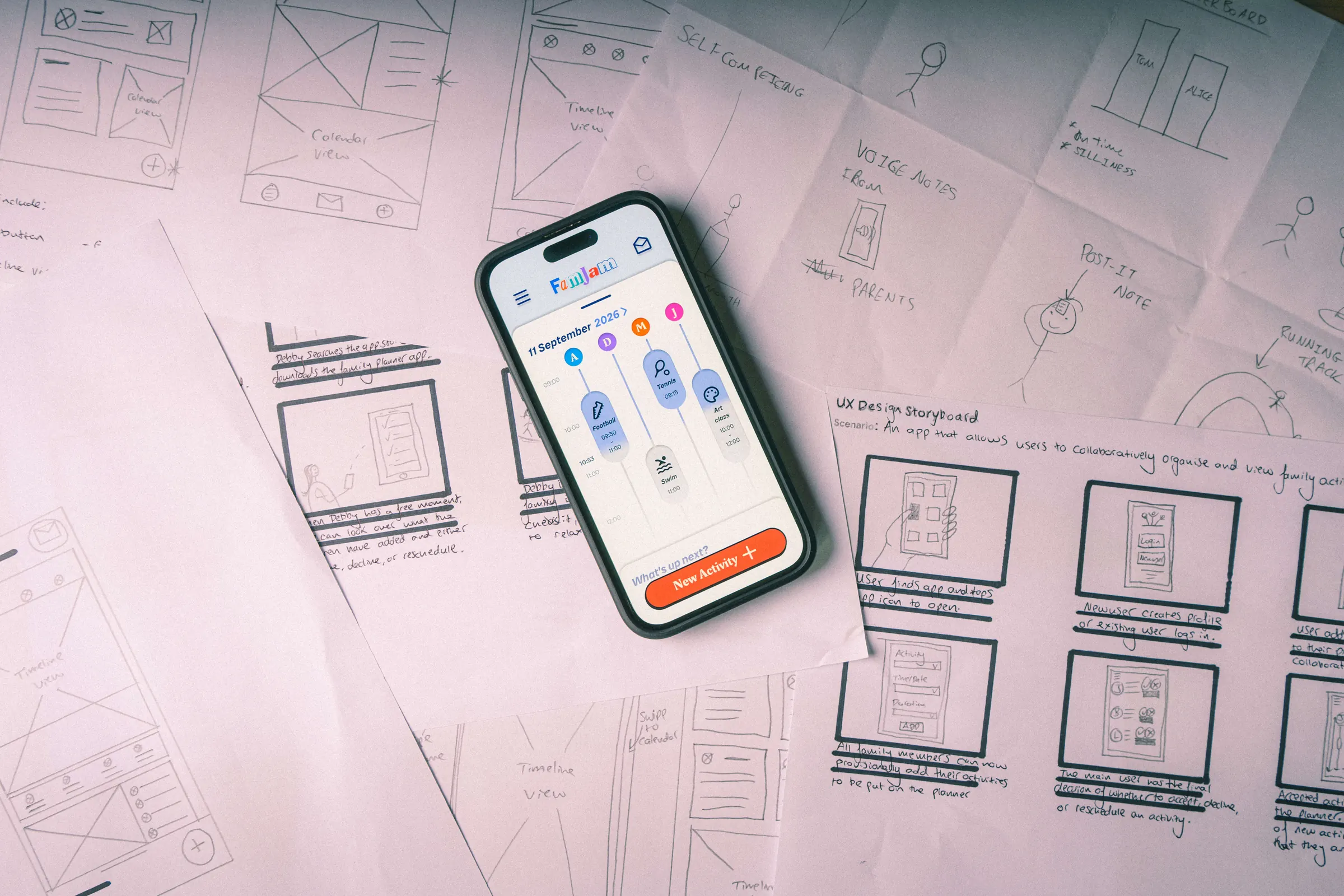
- Role
- Sole UX designer
- Timeline
- Aug – Oct 2026
- Tools
- Figma, Google Workspace
- Context
- Google UX Design Certificate
The brief
Design a family schedule-management app to enable parents to manage both their schedules and their children’s schedules.
How I read it
The brief focused on parents managing everyone’s schedules. My personas suggested the bigger problem was that one parent ends up doing it all, so I designed for the whole family to contribute, with one person approving.
Constraints
Solo coursework, about three months, no budget. Personas built from assumptions rather than interviews, and testing with family members.
Result97 average on the System Usability Scale after two rounds of testing.
Chapter 1, The problem: One person carries the whole family’s schedule
In busy families, one person usually organises everything. A calendar tells them when each activity starts, but not how the day will actually play out.
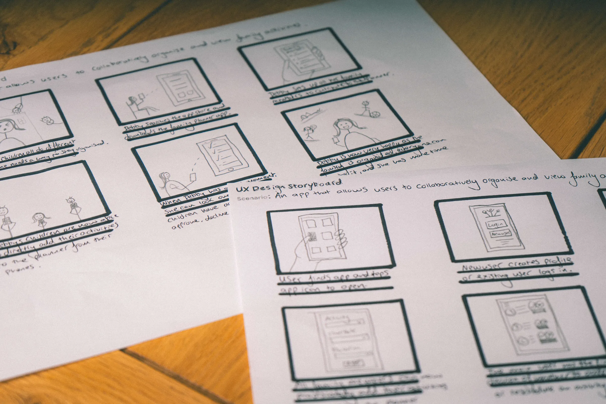
I framed the problem around Debby, a persona I built at the start of the project. She works full time and has three teenagers who all do different hobbies. She is the only one organising, and the kids are rarely ready on time.
My personas were based on assumptions, as the course guidance set out, rather than on interviews. So I treated them as hypotheses to test, and two rounds of usability testing with real parents did that testing.Footnote 1
Problem statement
Debby needs a visual, collaborative way to organise her family’s schedule that reminds everyone what’s coming up, because they all do different hobbies.
The gap: visual or collaborative, never both
I audited four competitors on one task: adding a new activity. Structured has a beautiful timeline but no sharing. Cozi is built for families but feels dated, and nothing in it makes the family want to join in.
The opportunity was a planner that is both highly visual and collaborative, and engaging enough that the whole family wants to use it.
Chapter 2, The idea: A timeline for every member of the family
The biggest gap was visual: a calendar shows when things start, not how the day will play out. That led to my first hypothesis, a timeline view. While sketching, I kept coming back to one question:
How might we
make a family planner
that isn’t
a calendar?
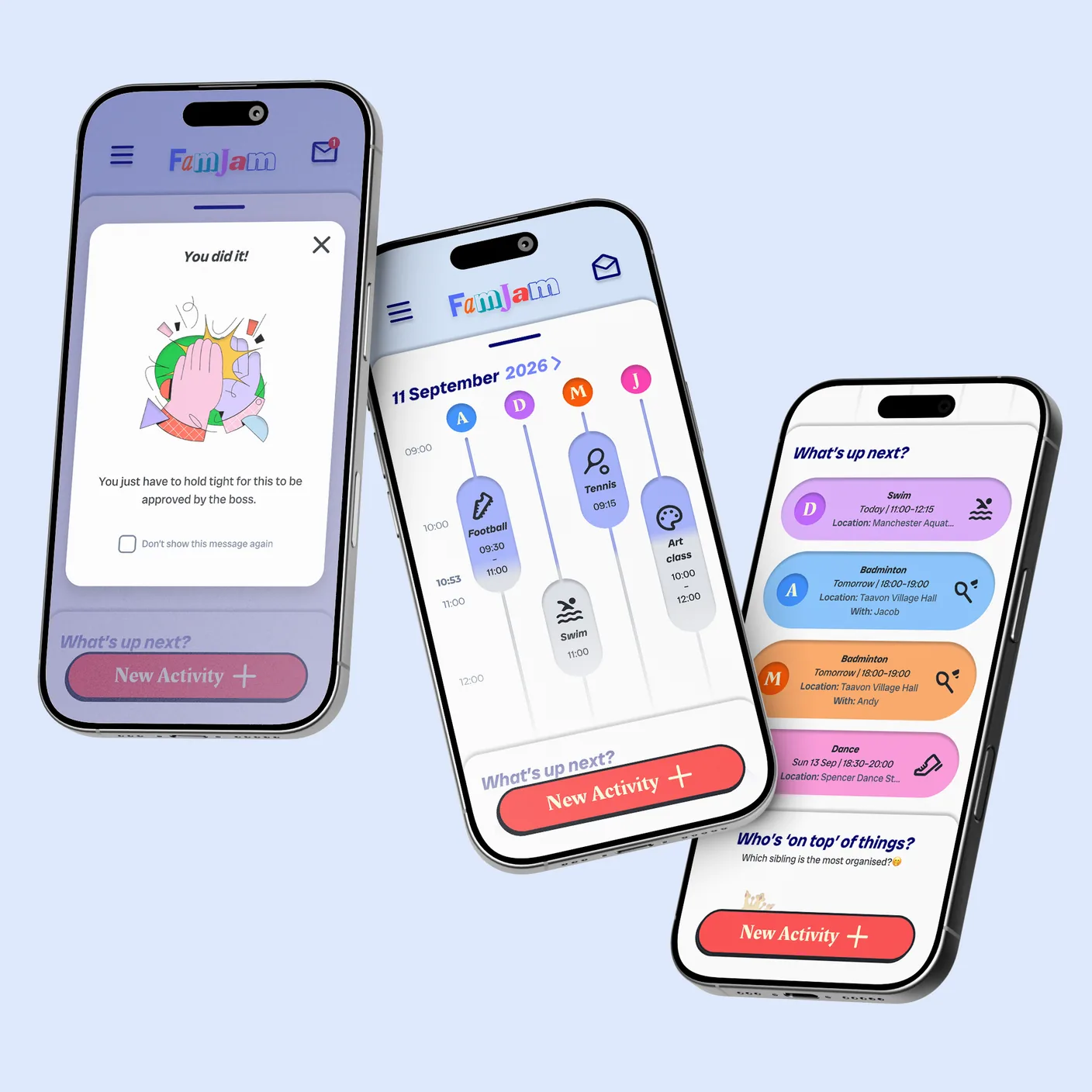
My answer was a timeline for each family member, side by side. Every activity is a block whose height shows how long it lasts, so you can see at a glance who is busy when and how the day will flow. Two more ideas tackled Debby’s other frustrations:
Idea A
A shared inbox
Anyone can add an activity, and the main planner approves, reschedules or declines it.
Idea B
“Who’s on top of things?”
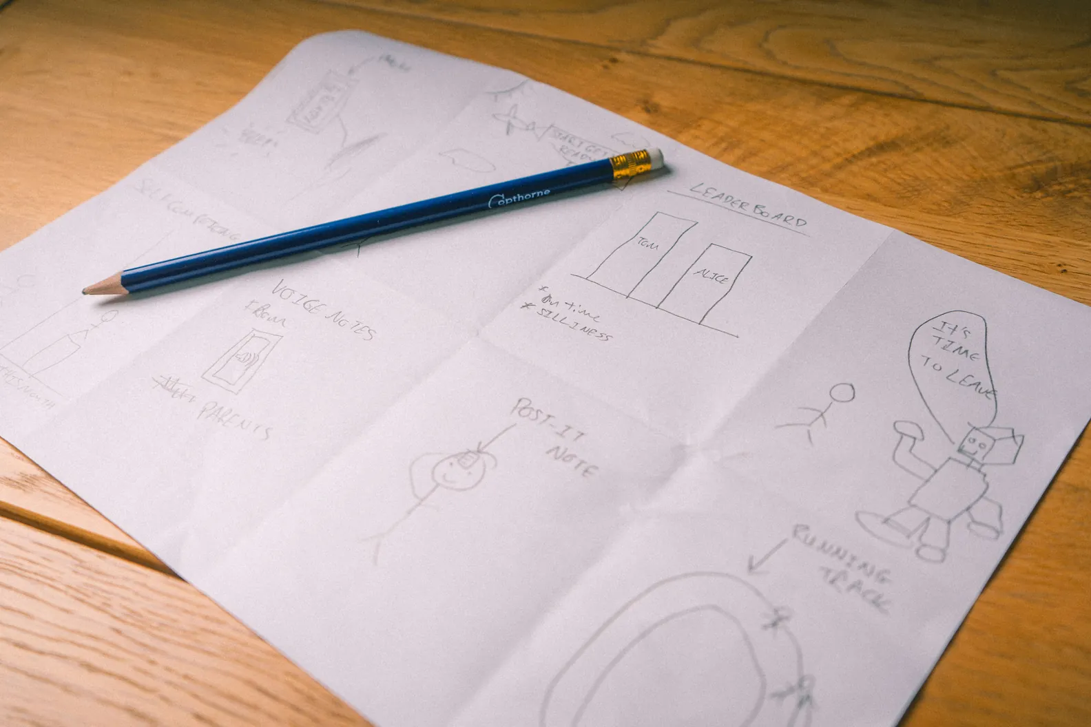
A light-hearted family leaderboard for being on time and helping out.
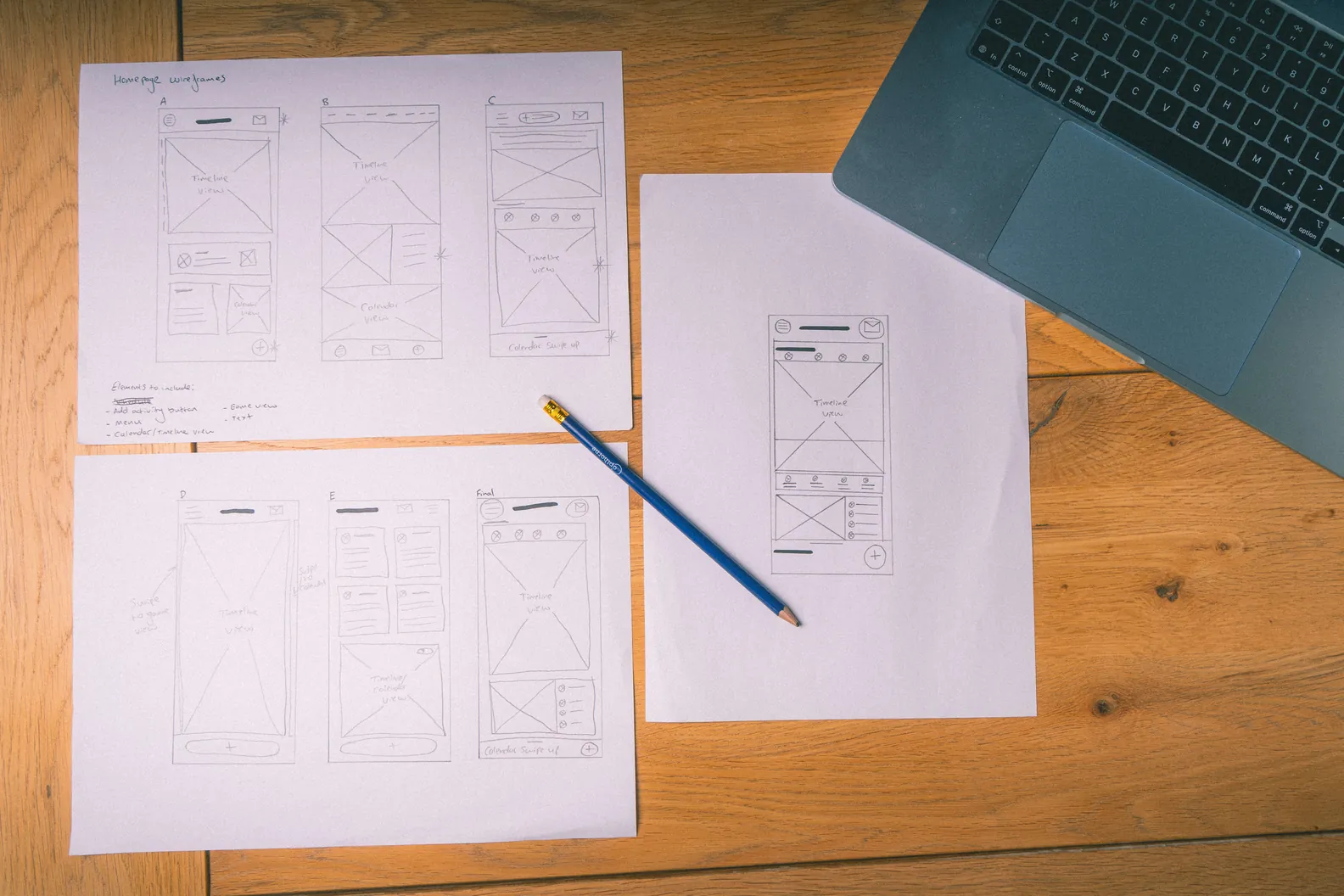
From sketches to wireframes
I sketched five homepage layouts before settling on one. The timeline stays the first thing you see, the add button sits apart from the menu, and a “What’s up next?” strip means nobody misses their next activity.

Chapter 3, Round 1 · Low fidelity · August 2026: The basics got in the way
The concept worked: every participant completed every task, and four of five praised the timeline unprompted. One thing got in their way, and three features were missing.
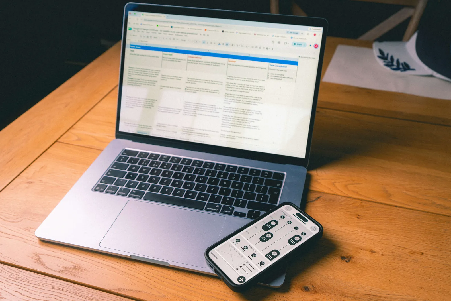
I wrote a study plan to find out what frustrated people when adding an activity, and what got in their way. Then I ran moderated, in-person sessions in Selby with five family members aged 26 to 59, each the main planner in their own household.
I chose moderated sessions so I could observe and ask follow-up questions in the moment. Being in the room also built rapport, and kept their full attention on the tasks.
They completed four tasks on my low-fidelity prototype: add an activity, invite family members, schedule it, then accept, reschedule and decline it.
I logged every session, grouped what I saw into themes, and prioritised them: anything likely to stop someone finishing a task in the real app came first, then the features people asked for.
What I found
3 out of 5
Got in the way
Couldn’t find the “+” button at first
Labelled it “Add new activity”, as a fourth person suggested
4 out of 5
Asked for
Expected a calendar for the date
Added a calendar picker
4 out of 5
Asked for
Wanted activities to repeat
Added repeat with a frequency
4 out of 5
Asked for
Wanted to give a reason when declining
Added an optional reason field
I really like the daily layout view on the homepage, I can see that being really helpful for keeping everyone on track.”
— P1, round 1
Oh, looks like I would just have to type the date in, I prefer a calendar view.”
— P1, round 1
Oh, there’s no way to make an activity repeat?”
— P3, round 1
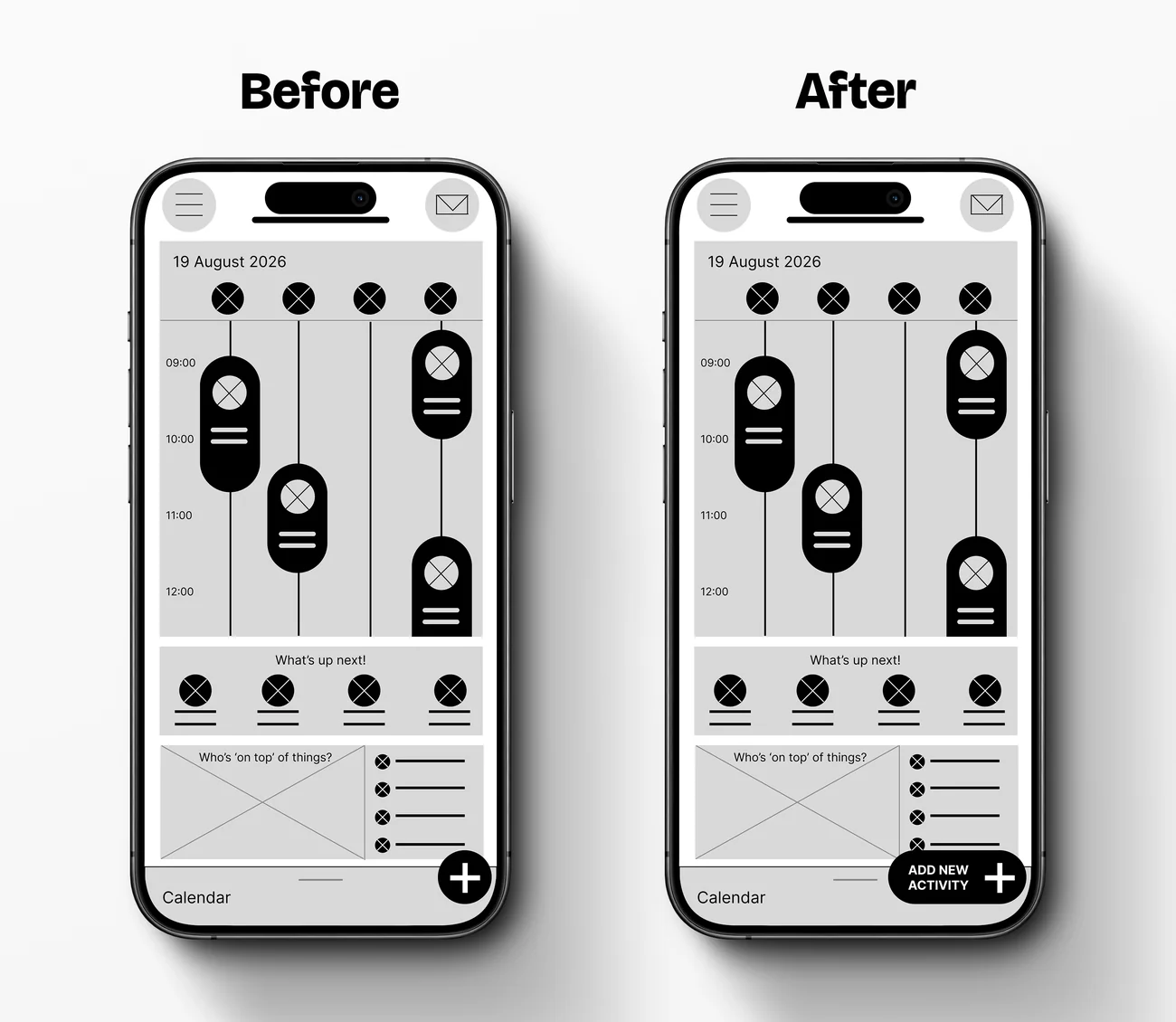
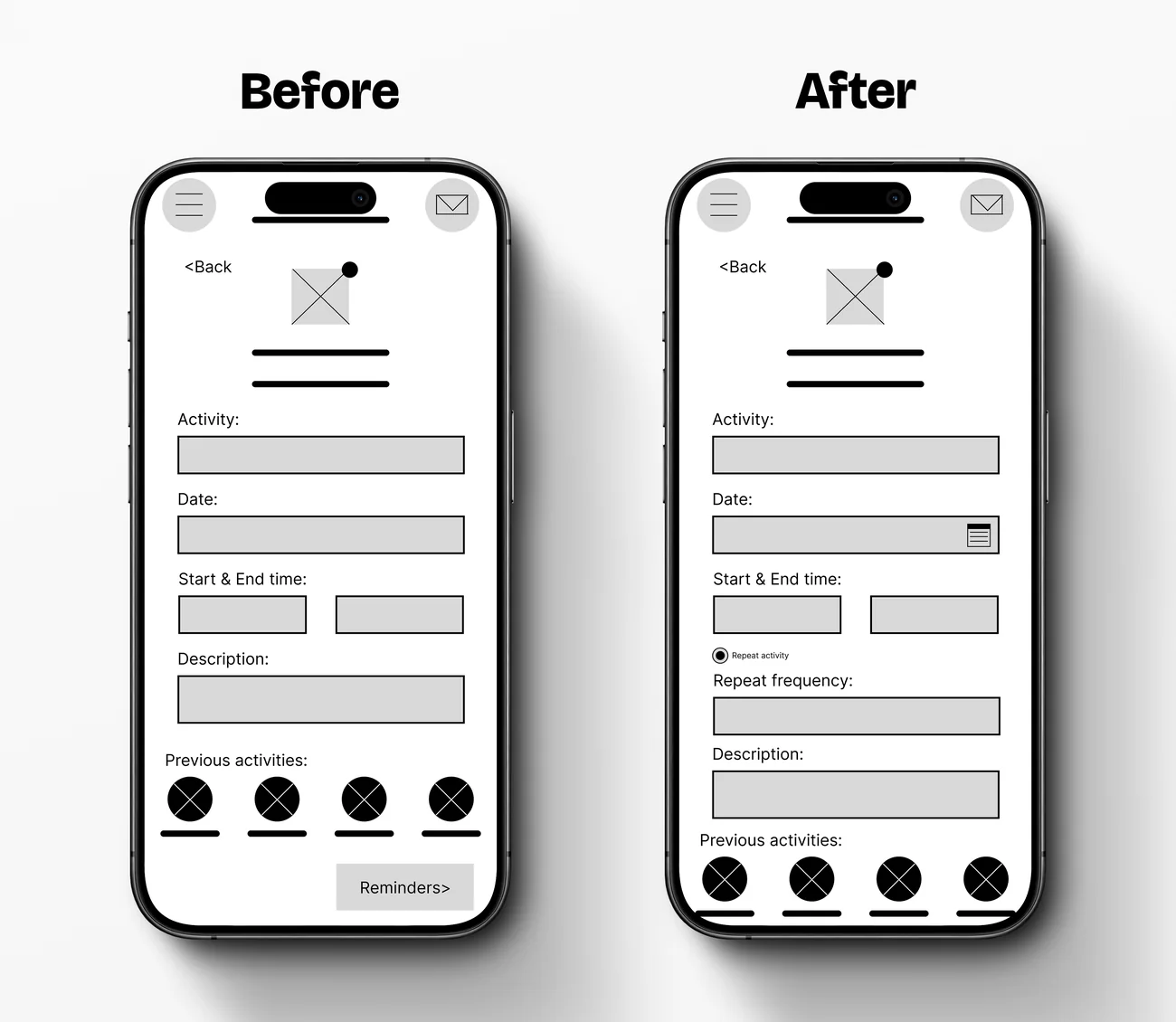
Chapter 4, Designing the high-fidelity version: Make it obvious without telling people
Round 1 taught me that small moments of uncertainty add up. So one principle guided the high-fidelity design:
Every screen should make the next step obvious, without needing instructions.
A two-step form. My first version was one long screen, which felt like a mountain to climb, so I split it in two.
“I like that adding a new activity is in two sections… especially good for when my kids use it.” (P3)
A preview card designed to build the activity as you type, so you can see it’s working. In the prototype it appears complete on step 2.
Time wheel pickers. Four of five people had expected a calendar for dates in round 1, so I extended the idea to times and tested it in round 2. It paid off.
“The calendar and time pickers make it really slick.” (P4)
A distinct colour for pending activities, so you can tell at a glance what’s waiting for approval.
A playful identity. Every letter of the logo is different, just like every member of a family.
Chapter 5, Design system and prototype: Built like a real product
Behind the screens is a design system, built in Figma alongside the app. Its 56 components are documented on their own Components page, and a sticker sheet shows every one of them in one place.
It’s a project in its own right, so it has its own case study.
Read the design system case studyHere’s the short version.
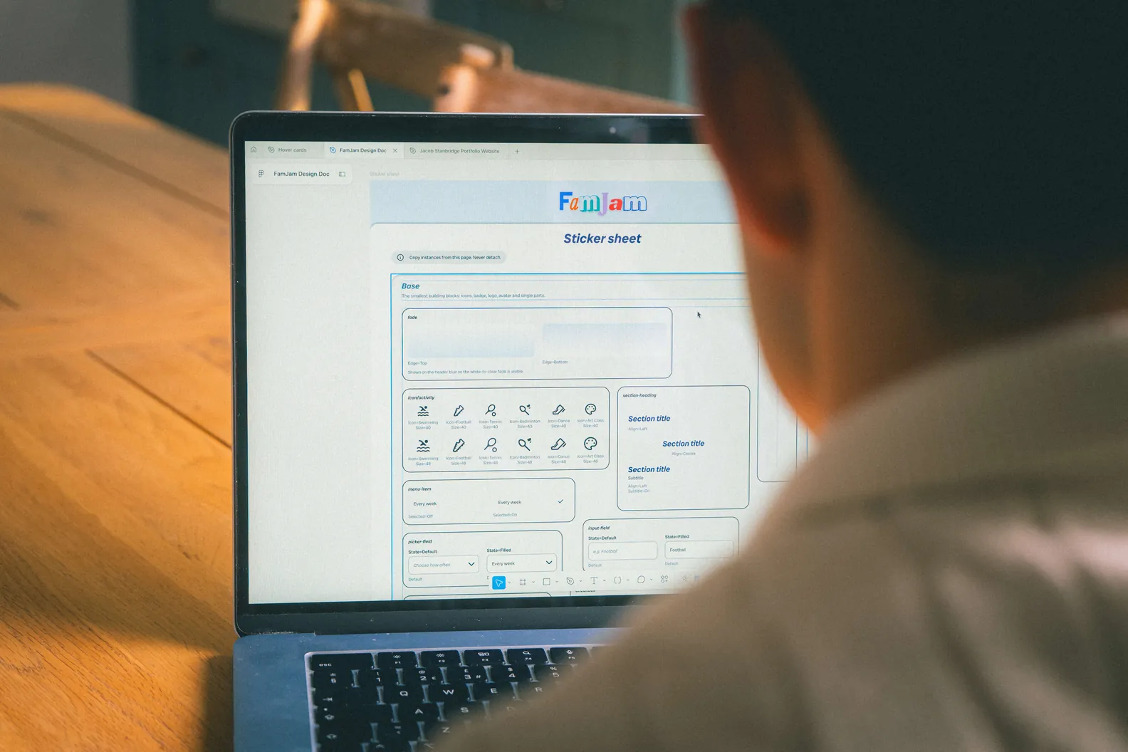
Components and sticker sheet
56
Components in three levels, from buttons to whole sections, with pressed and focus states on everything interactive. Colour, spacing and type all come from tokens in Figma variables.
Responsive by default
375 · 393 · 430
Every screen is built with auto layout and tested at three phone widths, in pixels, so it works on any phone.
A prototype with memory
Variables
The prototype remembers what testers input, and the date and time pickers really work. Round 2 testers used something close to a real app.
Chapter 6, Accessibility: Designed for everyone, from the start
A family app is used by everyone from kids to grandparents, so accessibility was built into the components rather than added at the end: contrast checked where things sit, 48 × 48 touch areas, more than 100 screen reader notes, and colour never the only signal.
Still to do
Designed and specified, but not yet tested with VoiceOver, TalkBack or disabled users.
Chapter 7, Round 2 · High fidelity · October 2026: The fixes worked, and two last snags
SUS score
/10097 out of 100
Average System Usability Scale score (range 90 to 100)
Net Promoter Score
+100
All 5 would recommend it
Tasks completed
/2020 out of 20
Every task, every participant
Tasks rated easy
/2018 out of 20
Two tasks rated harder: the two snags below
The same five family members took part in both rounds. They knew me and had already seen the app, so these scores are likely flattering: a strong signal, not proof.
I tested the high-fidelity prototype with the same planning, setup and screening as round 1, using two flows: adding an activity as a family member, and reviewing it as the main planner. Afterwards, each participant filled in a System Usability Scale questionnaire and rated how likely they were to recommend FamJam.
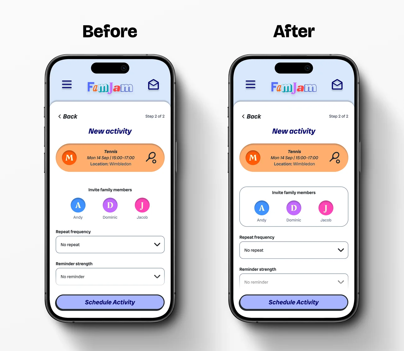
“Invite family members” felt lost on the page (4 of 5).
People found it, but only after a pause. I gave it its own bordered card.
“The 'Invite family members' bit looks a bit lost on the white page.”
— P1, round 2
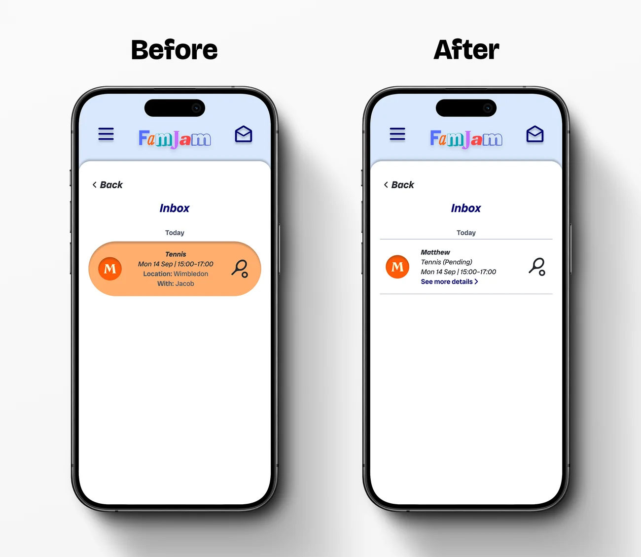
The pending activity in the inbox didn’t look tappable (2 of 5).
I redesigned it as a list row with a clear “See more details” link.
“The orange activity thing didn’t really look like a thing to click.”
— P5, round 2
Chapter 8, The final design: Answering Debby’s three problems
The finished prototype comes back to the three frustrations the project started with.
Problem 1
Debby can’t see how the day will play out.
Everyone’s timeline side by side, with “What’s up next?” below.
Problem 2
Debby is the only one organising.
Anyone can add an activity, and she approves, reschedules or declines it from the inbox.
“I love the fact that I don’t have to add everything for everyone like I am currently… this will save me a lot of time!” — P1, round 1
Problem 3
The kids are never ready on time.
Adjustable reminders, plus the “Who’s on top of things?” leaderboard. The leaderboard is designed but not yet tested.
Chapter 9, Reflection: What I learned, and what’s next
What I learned
The biggest surprise was how much I’d taken for granted. Things that felt obvious in my low-fidelity prototype weren’t obvious to the people using it: three of five couldn’t find the “+” button at first. Now I treat “obvious” as something to test, not assume.
I learned Figma as I went, and my first drafts were built before I knew about auto layout. Next time I’d plan with it from the very first wireframe, so the screens are responsive from the start rather than rebuilt later.
I’m proudest that FamJam feels colourful and friendly while staying simple. People used it with very little text on screen and no in-app instructions, which is exactly what I set out to do.
What I’d do next
Test the leaderboard with real families: does it motivate kids, or sting?
Re-test the round 2 fixes: the new invite area and inbox row.
Test beyond my family, including teenagers and non-planners, and run some sessions unmoderated.
Add a message when inviting someone, requested in both rounds.
Make the full-day timeline easier to find.
Verify with VoiceOver and TalkBack, and add dark mode.