- Role
- Sole designer
- Timeline
- Sep – Oct 2026
- Tools
- Figma variables, components, auto layout; Material Symbols
- Context
- Self-initiated, alongside the Google UX course
The why
A design system wasn’t part of the course. I built one to learn how good design is put together.
Constraints
Solo and new to design systems, learning with Claude as an expert tutor, alongside building the app itself.
The system, by the numbers
56
Components, in three levels
3
Variable collections: Primitives, Semantic, Member
13
Text styles across three typefaces
100+
Screen reader annotations
Chapter 1, The starting point: A home screen with nothing reusable
FamJam’s first home screen was designed screen by screen. It looked finished, but nothing underneath it was reusable.
What I found
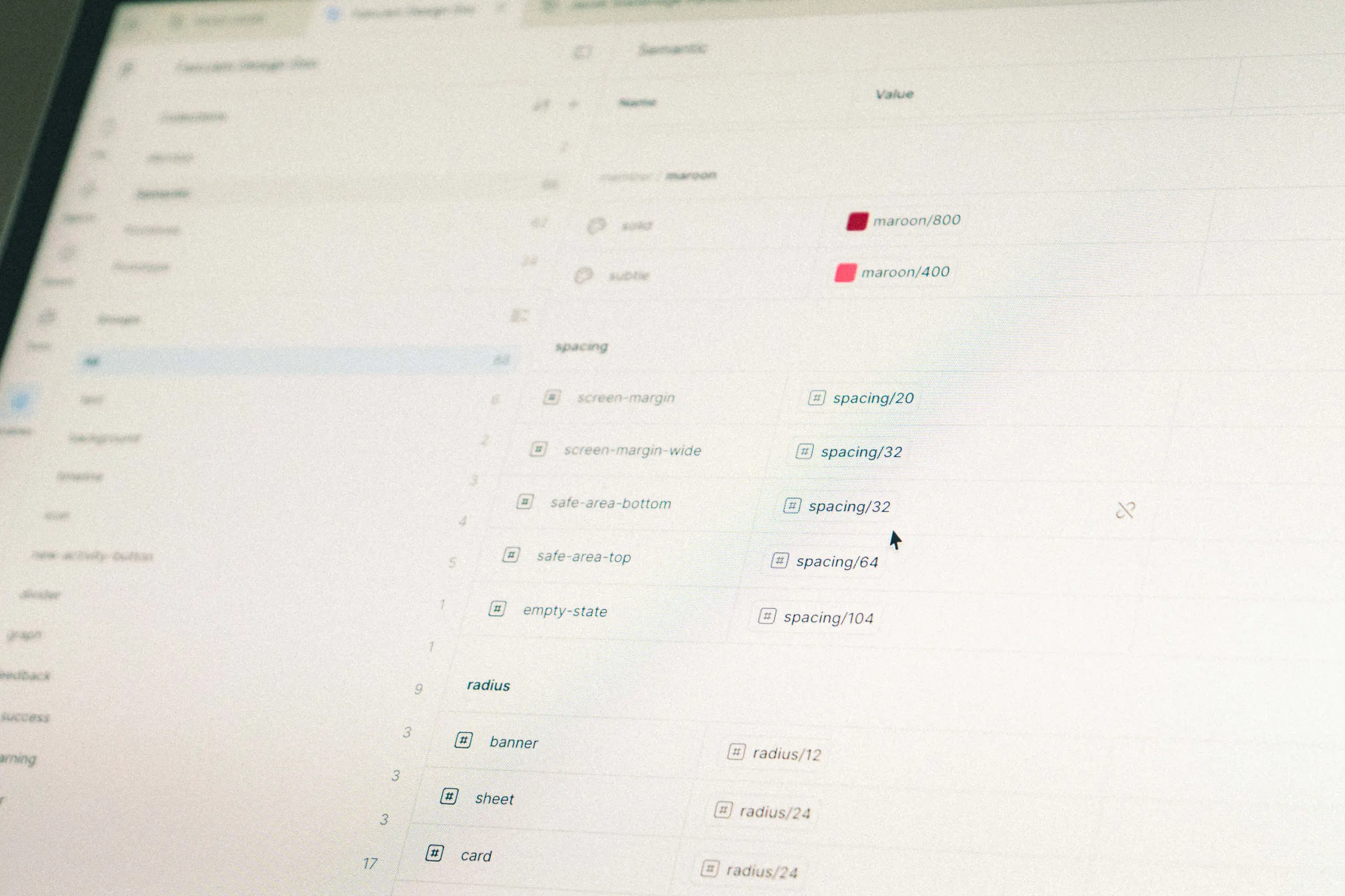
Colours and spacing set loosely, with many near-duplicate values
One-off shadows, each set by hand
Icons at mixed weights and sizes
Three typefaces, but no type scale or rules for when to use each
Every change meant finding and fixing each layer by hand.
Before designing more screens, I wanted one source of truth.
Chapter 2, The approach: One section at a time
I built the design system in nine sections, from colour through to the sticker sheet and an introduction page. Most followed the same loop:
Step 01
Audit
What did the home screen already use?
Step 02
Rules
Turn what the audit found into tokens, styles or components.
Step 03
Document
Record the reasoning, rules and accessibility notes on the Design System page.
Repeat for each of the nine sections
| Preview | Surface | Shadowtype · blur · X · Y · opacity | Linked | Proposed effect style name (new) |
|---|---|---|---|---|
| Timeline sheet | Drop · 4 · 0 · −4 · 25% | Yes | shadow/sheet | |
| What's up next and Who's on top sheets (2) | Drop · 4 · 0 · −4 · 25% | No | shadow/sheet |
Why go this deep
Even if I never build another system, I’ll understand how any system I join is set up, and why.
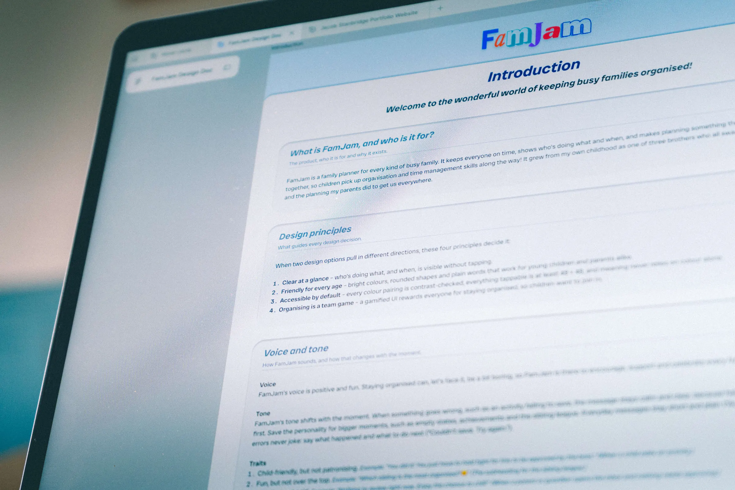
A design system wasn’t part of the Google UX course: I chose to build one alongside FamJam to push my knowledge further. It would teach me Figma properly, and more importantly, how good design is put together.
Chapter 3, Foundations: Every value becomes a token
Tokens come in two layers: primitives say what values exist, and semantic roles say what they’re for. Change a role and every place that uses it follows, and dark mode can be added later as a second mode.
The test for every token
Should this change together everywhere?
Colour
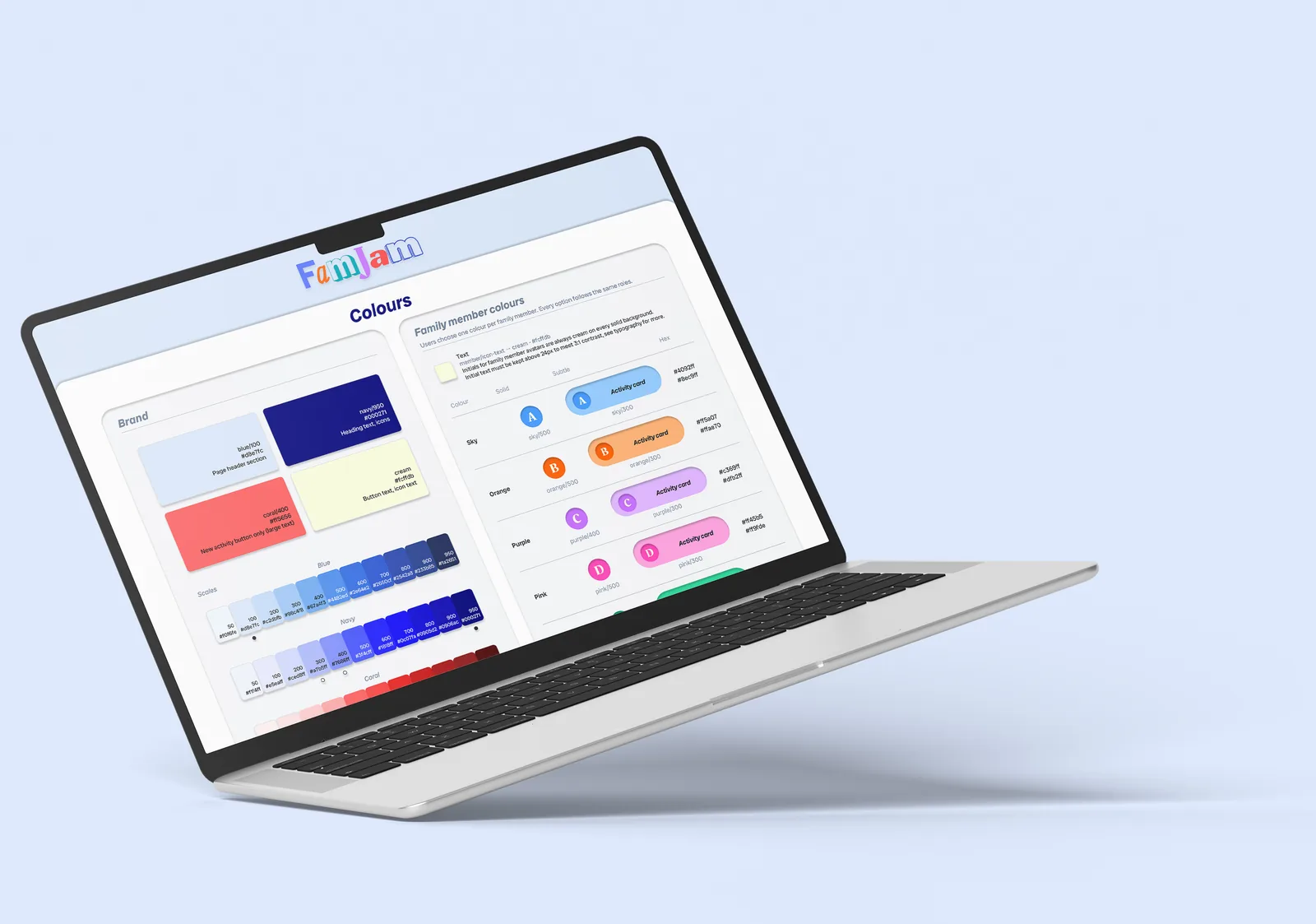
Brand, neutral, feedback and member primitives, with roles such as text/primary.
Type
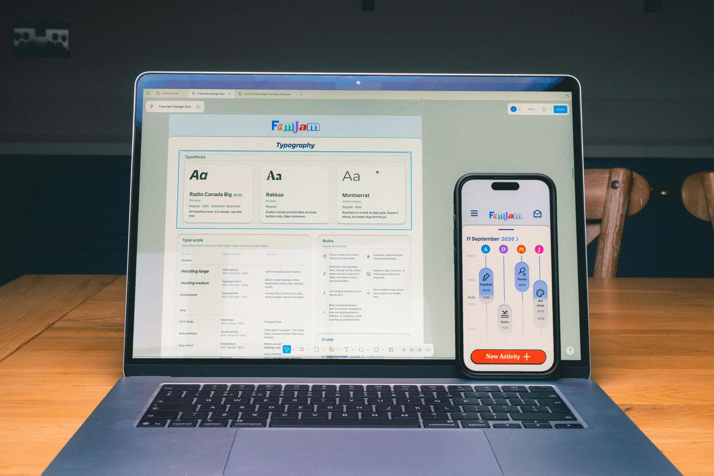
Three typefaces, each with one job, and 13 text styles. Styles say what kind of text it is; colour tokens say how prominent.
Spacing
An 8px grid with 4px half-steps, plus radius and border-width roles.
Shadows
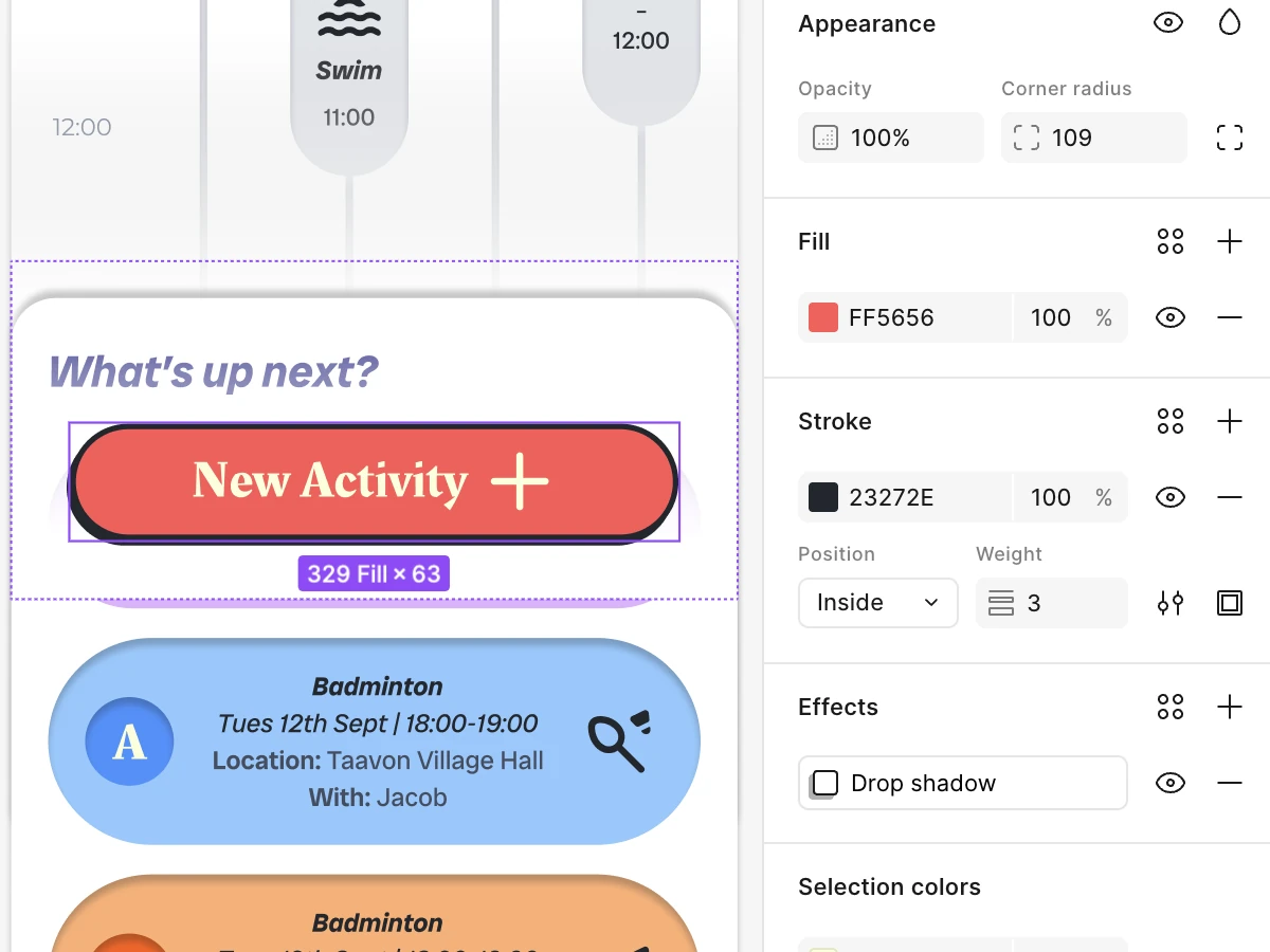
Raised, sheet and inset, chosen by job, plus one-offs for the logo and the New Activity button.
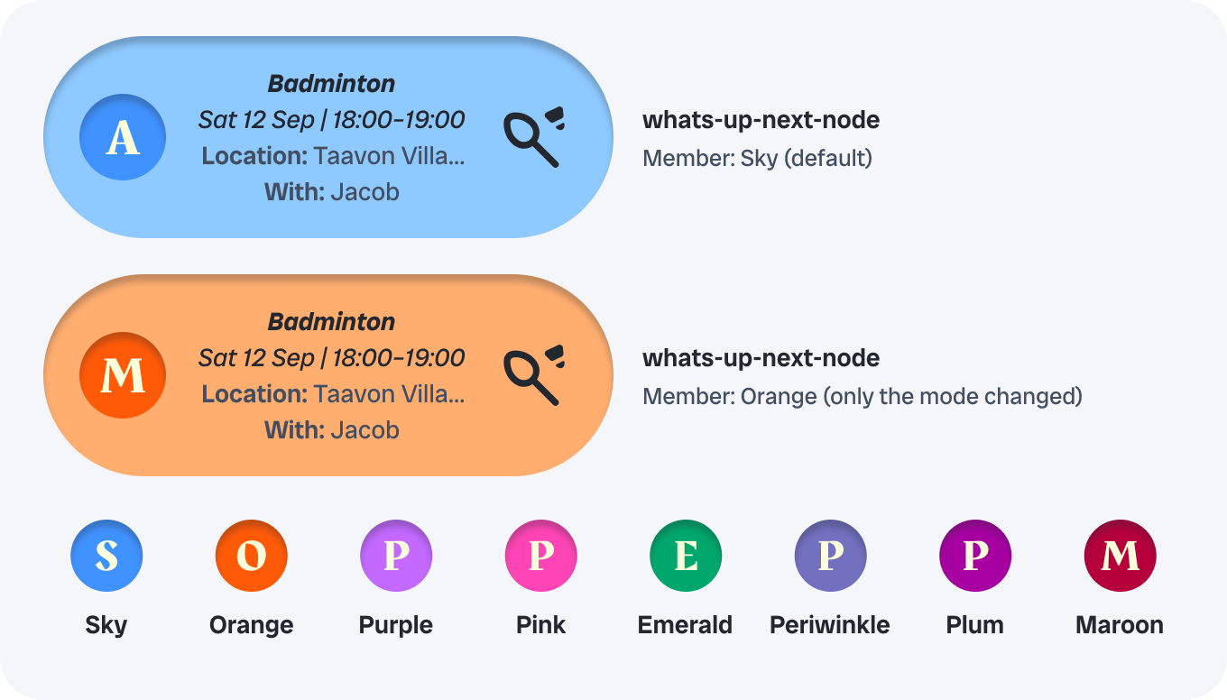
8modes
Eight family colours, one switch
A Member collection holds eight colours as modes. Setting the mode on a component recolours the avatar and its card together. Red is left out, because it means destructive actions and errors.
Icons and the logo
Icons
One set, Material Symbols, with five fixed settings. Rounded matches the rounded letters of the main typeface and the pill-shaped cards, and weight 600 matches the bold headings, so icons and text feel equally strong. I chose Rounded over Outlined by comparing them side by side.
- StyleRounded
- Weight600
- FillOff
- GradeNormal
- Optical sizeMatches the frame
Four sizes, and every tappable icon gets a 48 × 48 tap area: the area grows, not the icon.
The logo
A single component, so it’s never retyped as live text. Clear space is the height of one red “a” from the logo on every side, rounded up to the next spacing step.

- Standard
- 147 × 40
- Minimum
- 100 × 27
- Backgrounds
- 2 approved
- Misuse
- 6 examples
Chapter 4, Components: Built bottom up, ready to hand over
The first version had 27 components, built in three levels. Something became a component when it was used three times or more, or held a decision I wanted to stay consistent. Building the prototype later grew the library to 56 (see section 6).
27 to 56
components, first version → final
Built from the bottom up
Four component rules
One property per decision, named by value: Size=40 State=Pressed
Default, Pressed and Focus states on everything interactive.
Every tappable component at least 48 × 48.
Built as if handing it to a developer: names that map straight to code, and every component description and accessibility note readable in Dev Mode.
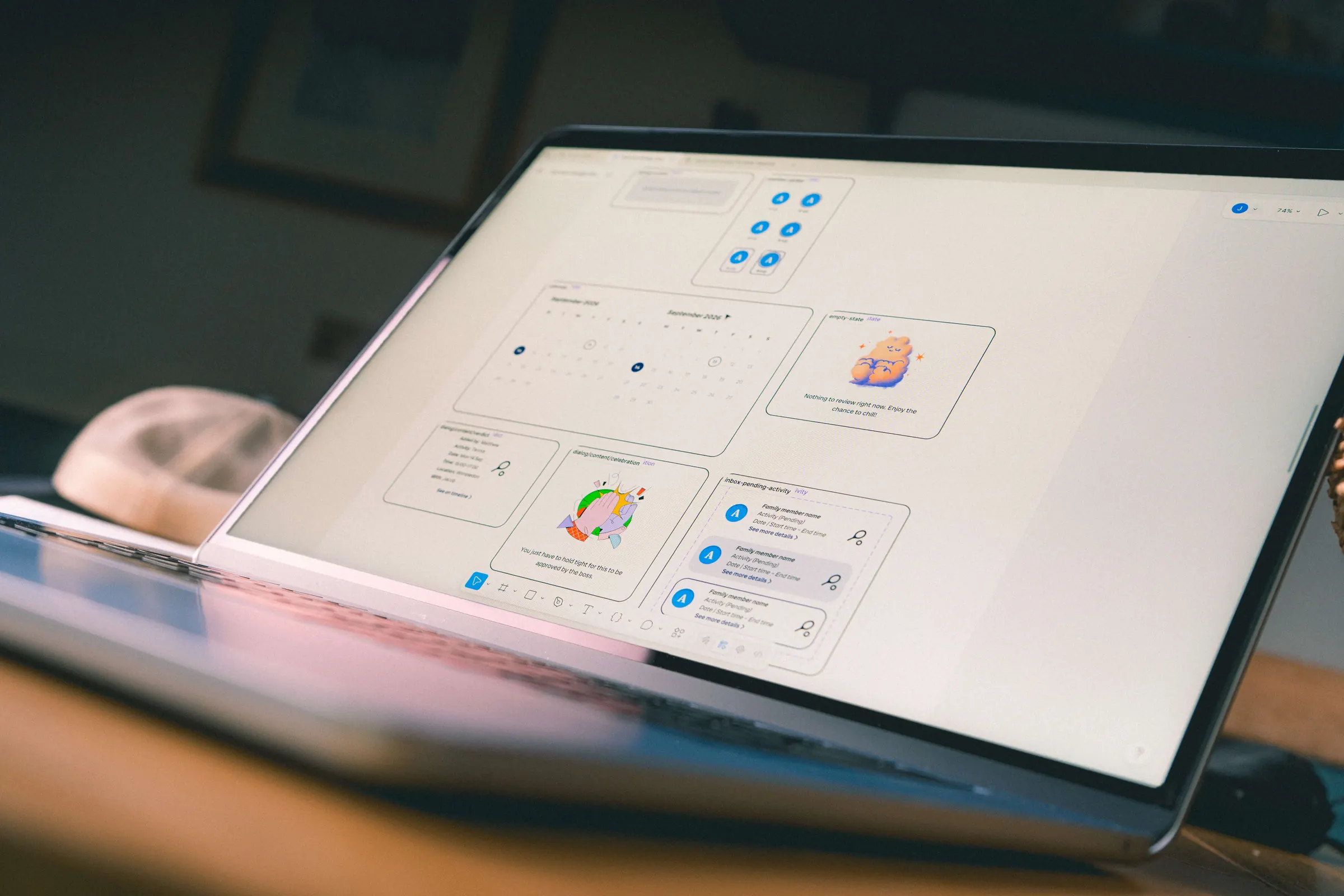
The sticker sheet
Every component as a labelled instance, so anyone can browse, copy and check them without touching the main components.

Chapter 5, Accessibility: Fixed once, inherited everywhere
Accessibility fixed screen by screen gets lost at the next change, so I fixed it in the components instead, where every screen inherits it.
Contrast, checked in context
2.0 to 3.2
The date arrow failed in place. Two token changes took it past WCAG’s 3:1 minimum. Placeholders went from 3.7:1 to 4.8:1, passing the 4.5:1 minimum for text.
Touch areas
Text links were 28px tall to tap. The tap area grew to 48px; the text stayed the same size.
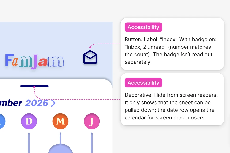
Screen reader notes
Annotations in one format: role, label, state, hint. Dates written as they’re spoken.
Never colour alone
Every family colour comes with an initial, so nobody relies on colour to know whose activity it is.

A trade-off, documented on purpose
Testing showed the New Activity button wasn’t noticeable enough, so it became bold coral.
Its label only passes contrast because the text is large, so it’s recorded as a single, scoped exception rather than a pattern anyone could reuse.
Chapter 6, Putting it to work: The real test is new work
26
New screens designed for the prototype
73
Fixes found by the audit
33
Additions found by the audit
For the high-fidelity prototype I designed 26 new screens, then audited them against the system before polishing anything.
Most traced back to one cause: I’d drawn the forms, buttons and dialogs by hand. So I built those components first, and around half the list fixed itself.

27 to 56
Components, with states and 48px targets on everything interactive.
Instances
Every screen rebuilt from components, with one documented exception: a timeline where an activity sits partly above the top of the screen, which the component can’t place.
−710px
The gap holding the home screen together, replaced with responsive auto layout. All frames tested at 375, 393 and 430px wide.
23
Hidden prototype variables that fill in fields from the test script and stop pressed states getting stuck.
Component 56
Found in testing, fixed the same day.
In round 2, 2 of 5 participants didn’t realise the pending activity in the inbox could be tapped. It looked like a label, not a button.
The same day, I built a new component: a list row with a clear “See more details” link. It used only existing tokens, with no new colours, sizes or styles. That’s what the system was for: a problem found in testing was fixed without redesigning anything.

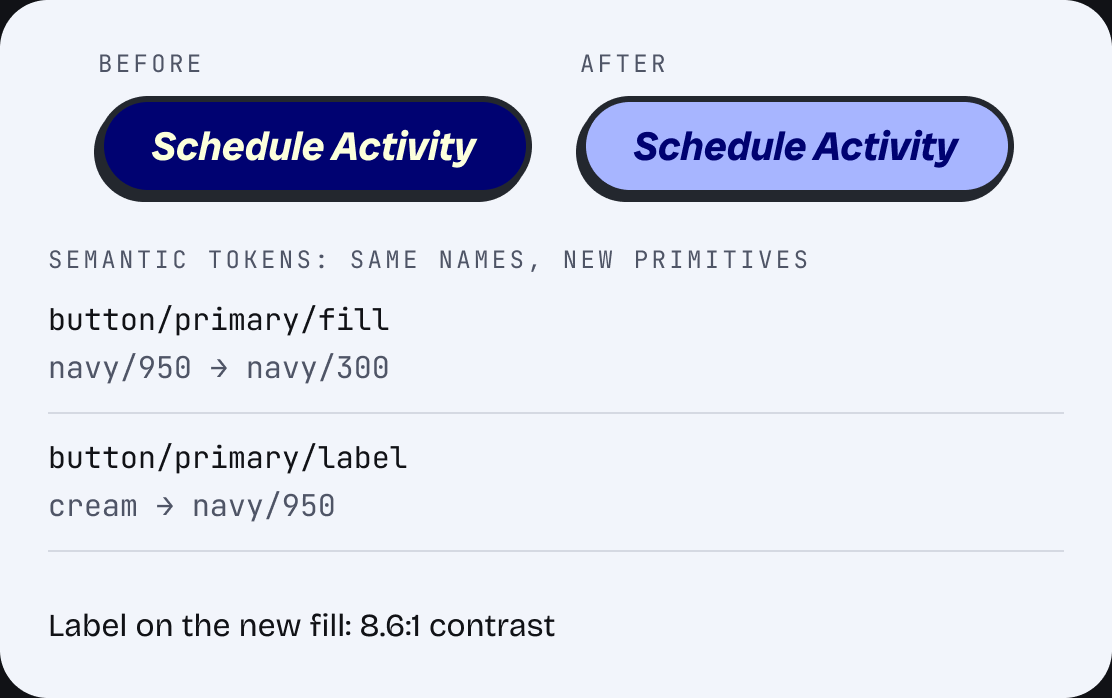
The moment tokens paid off
Near the end, the dark navy button felt too heavy for a playful family app.
Every primary button points at two tokens, so I compared options side by side, changed the tokens and checked contrast (8.6:1).
Every primary button updated.
Chapter 7, Reflection: What I learned, and what’s next
The biggest surprise was how much of good design comes from structure. I’d always thought it was mostly about having a creative eye, but structure is what brings the consistency that great designs share.
What I learned
Nearly every step was a new concept, from tokens and auto layout to audits and focus states. Modes, naming conventions and writing documentation a developer could pick up took me the longest.
I didn’t move on until I understood each one, often asking Claude to set me practice tests on whatever I was stuck on. Being able to ask endless questions without breaking my train of thought meant I learned far more, far faster.
Next time I’d document as I go rather than afterwards. What I’m proudest of is how much I now understand: not just how to use Figma, but why systems are set up the way they are.
Tried and dropped
Amber buttons
They failed contrast at 2.1:1.
A live-updating New Activity card
Binding it to variables lost its bold “Location:” label, so I kept the component as it was.
A Pressed state on menu items
Tried twice and reverted, because it fought the variables behind each item.
What I’d do next
Dark mode, as a second mode on the Semantic and Member collections.
Test with VoiceOver, TalkBack and larger text sizes.
Rebuild the Colours page from text styles and tokens.
Describe every variable and publish the library.
Balance the family colours, starting with maroon next to the coral.