Case study 01 · App design

FamJam

How I designed FamJam: a planner that shows everyone’s day side by side and lets the whole family add to it, not just one person.

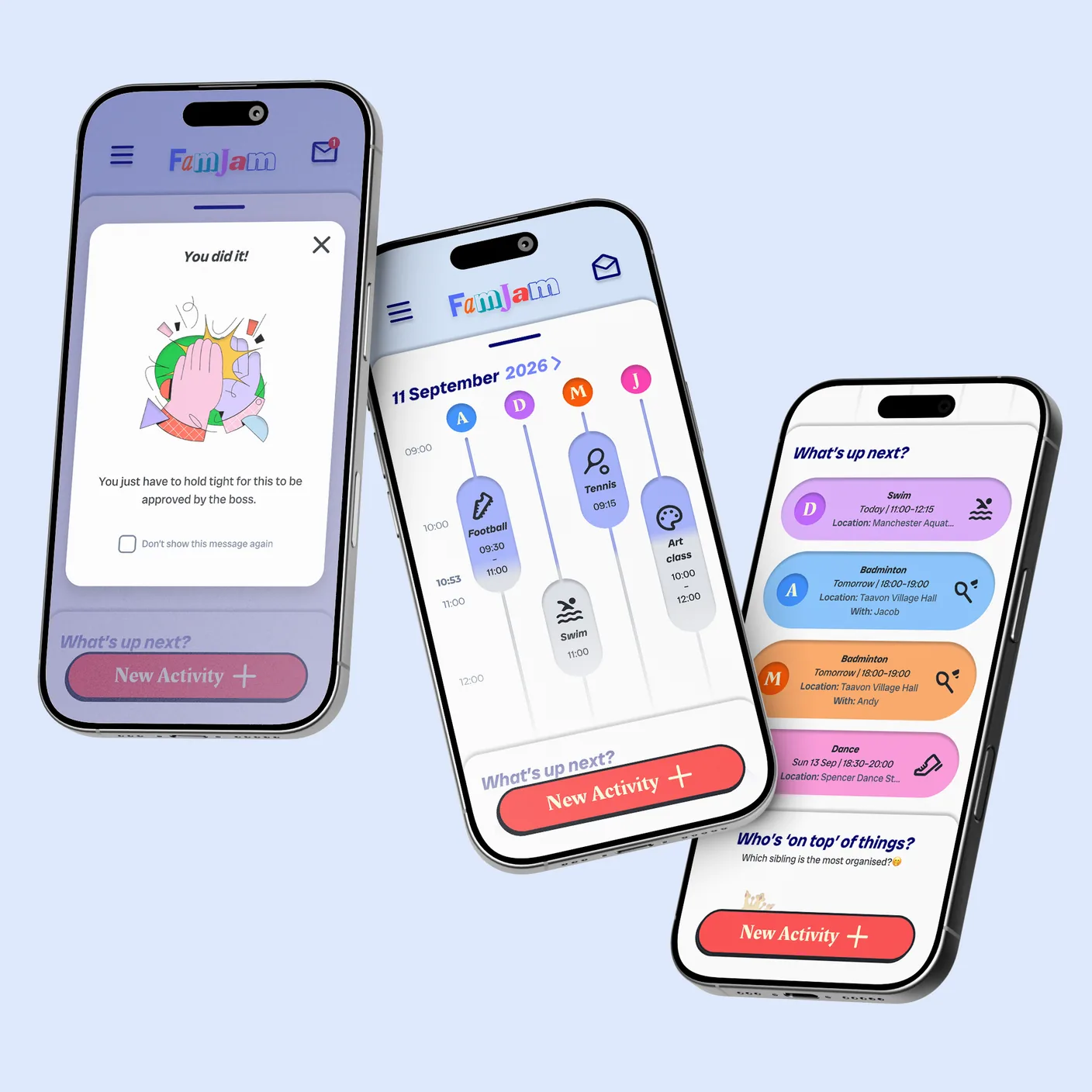
Three FamJam screens on phones: the family timeline, the What’s up next list and a “You did it!” message.
Role
Sole UX designer
Timeline
Aug – Oct 2026
Tools
Figma, Google Workspace
Context
Google UX Design Certificate
Back to work

Skim in about 3 minutes · 8 cards

At a glance

The brief

“Design a family schedule-management app to enable parents to manage both their schedules and their children’s schedules.”

Constraints

Solo coursework, about three months, no budget. Personas built from assumptions, and testing with family members.

Result

97average on the System Usability Scale after two rounds of testing.

The project in eight steps

Eight steps · hover over a card to see the skills behind it

Eight steps · tap a card to see the skills behind it

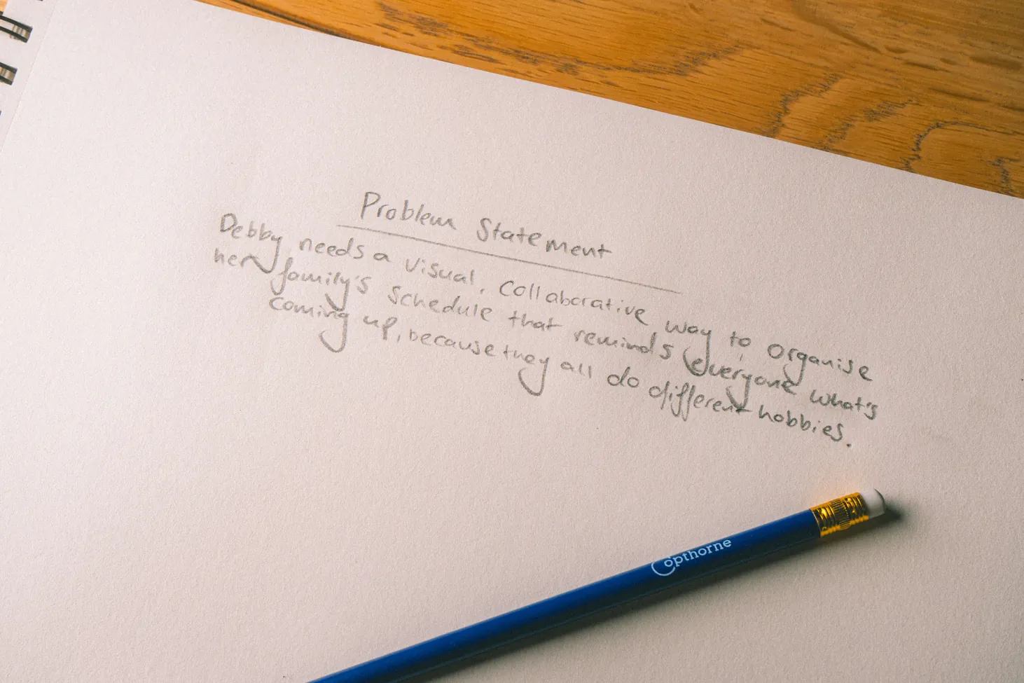
Jacob’s handwritten problem statement: “Debby needs a visual, collaborative way to organise her family’s schedule that reminds everyone what’s coming up, because they all do different hobbies.”

The problem

One person carries the whole family’s schedule

The brief was about parents managing everyone’s schedules. My persona, Debby, showed the real problem: she organises everything for three busy teenagers, and a calendar shows when things start, not how the day plays out. None of the four apps I audited was both visual and collaborative.

4

Competitors audited

0 of 4

Visual and collaborative

3

Personas

01 · Skills shown

  • Interpreting a brief
  • Personas, treated as hypotheses
  • Problem statement
  • Competitive audit of four apps
  • Finding the gap in the market
Read the full chapter : The problem
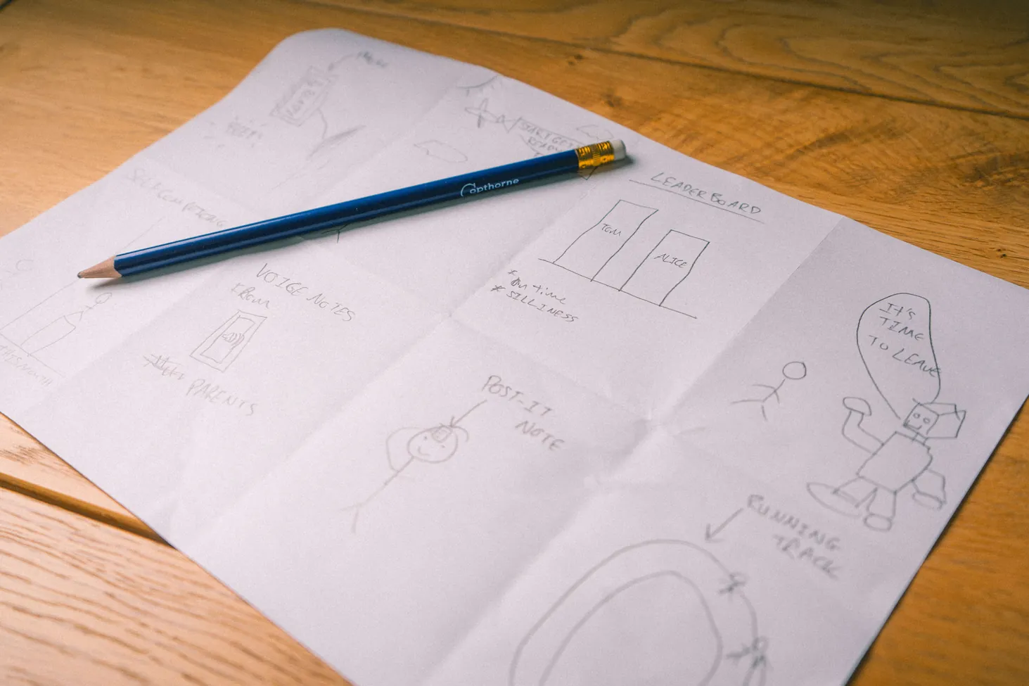
Pencil sketches of FamJam ideas on a sheet of paper.

The idea

A timeline for every member of the family

How might we make a family planner that isn’t a calendar? My answer: a timeline for each family member, side by side, where each activity’s height shows how long it lasts. Two more ideas tackled Debby’s other frustrations: a shared inbox, so anyone can add an activity for her to approve, and a light-hearted family leaderboard.

3

Core ideas

5

Homepage layouts sketched

8

Crazy 8s sketches

02 · Skills shown

  • “How might we” framing
  • Storyboards
  • Crazy 8s
  • Sketching five homepage layouts
  • Paper wireframes
  • Information hierarchy
Read the full chapter : The idea
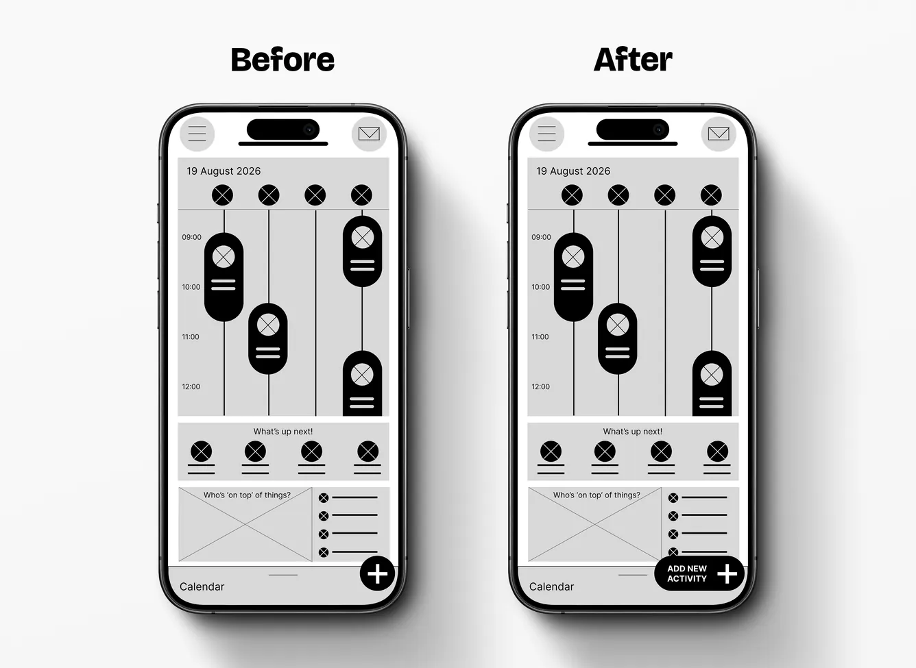
The home screen wireframe before and after round 1: the + button becomes a labelled “Add new activity” button.

Round 1 testing · Low fidelity

The basics got in the way

I ran moderated, in-person sessions with five family members aged 26 to 59, each the main planner at home. Everyone finished every task and four praised the timeline unprompted. But the basics got in the way: three couldn’t find the “+” button. I labelled it, and added the three features most people asked for.

5

Participants

4/5

Praised the timeline

3/5

Missed the “+” button

03 · Skills shown

  • Low-fidelity prototype in Figma
  • Usability study plan
  • Moderated, in-person sessions
  • Task-based testing
  • Observation and note-taking
  • Grouping findings into themes
  • Prioritising by impact
  • Iterating on findings
Read the full chapter : Round 1 testing · Low fidelity
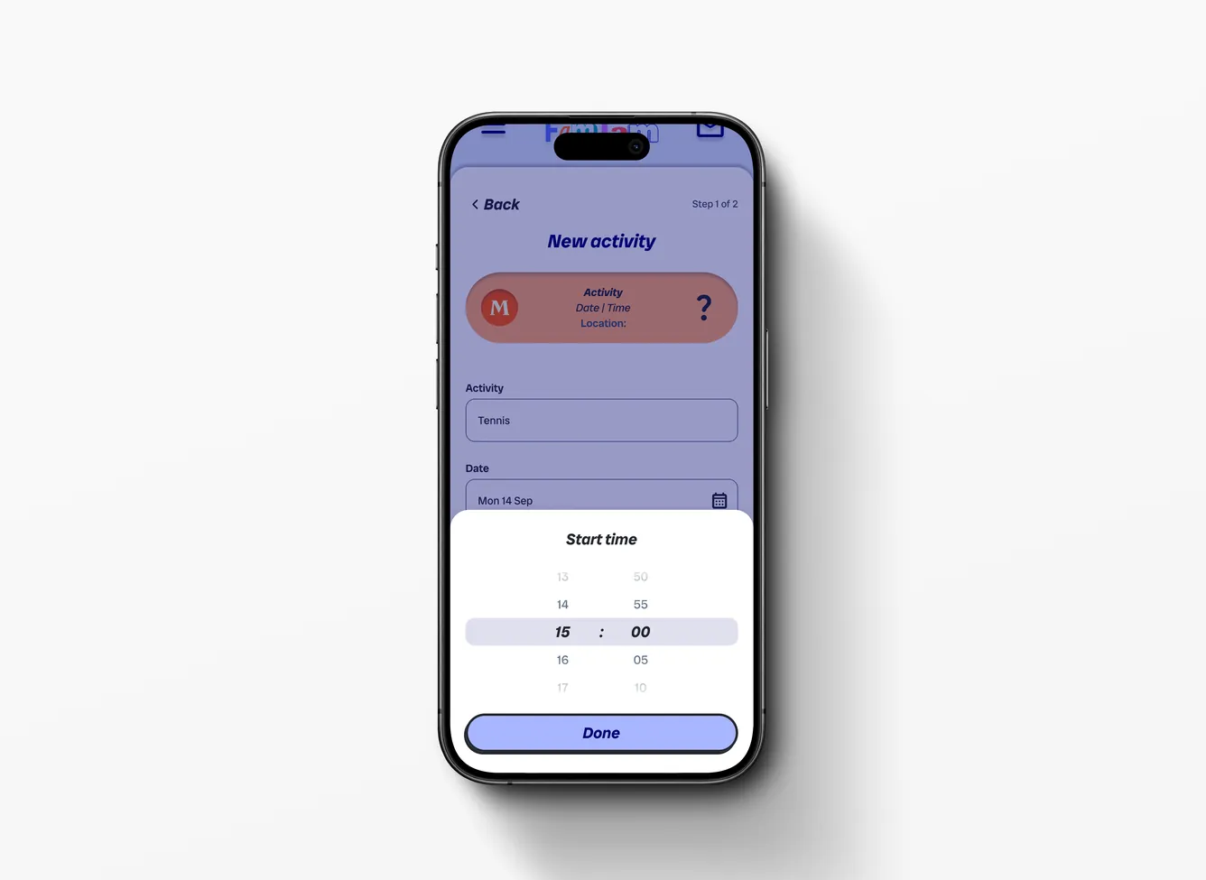
The FamJam New activity screen on a phone.

High-fidelity design

Make it obvious without telling people

One principle guided every screen: make the next step obvious, without instructions. A long form became two short steps, a preview card shows the activity as you build it, time wheel pickers extend the calendar people asked for, and a distinct colour marks activities waiting for approval.

1

Guiding principle

2

Form steps, from one long screen

4/5

Had asked for a calendar

04 · Skills shown

  • Setting a design principle
  • High-fidelity mockups
  • Interaction design
  • Form design
  • Exploring and dropping options
  • Visual identity and logo
  • Interactive prototyping
Read the full chapter : High-fidelity design
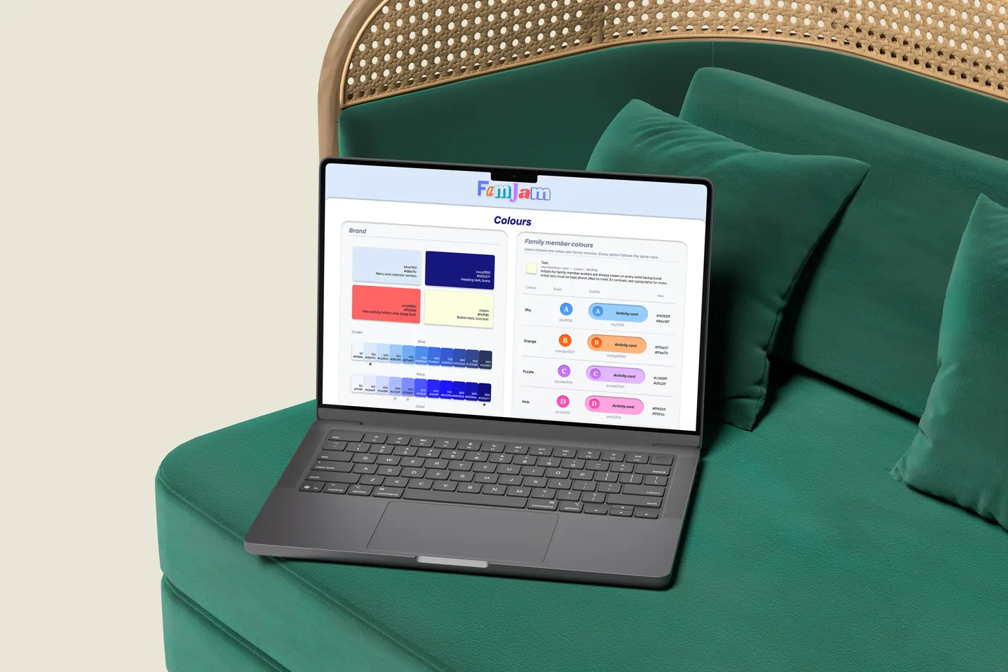
A laptop on a green sofa, showing the Colours page of the FamJam design system.

Design system and accessibility

Built like a real product

Behind the screens is a design system built in Figma: components, tokens for colour, spacing and type, and every screen in auto layout. Accessibility was built into the components, and the prototype remembers testers’ inputs, so round 2 felt close to a real app.

56

Components

3

Phone widths tested

100+

Screen reader notes

05 · Skills shown

  • Building a design system
  • Figma variables and tokens
  • Responsive auto layout
  • Prototyping with variables
  • Contrast and touch targets
  • Screen reader annotations
Read the full chapter : Design system and accessibility
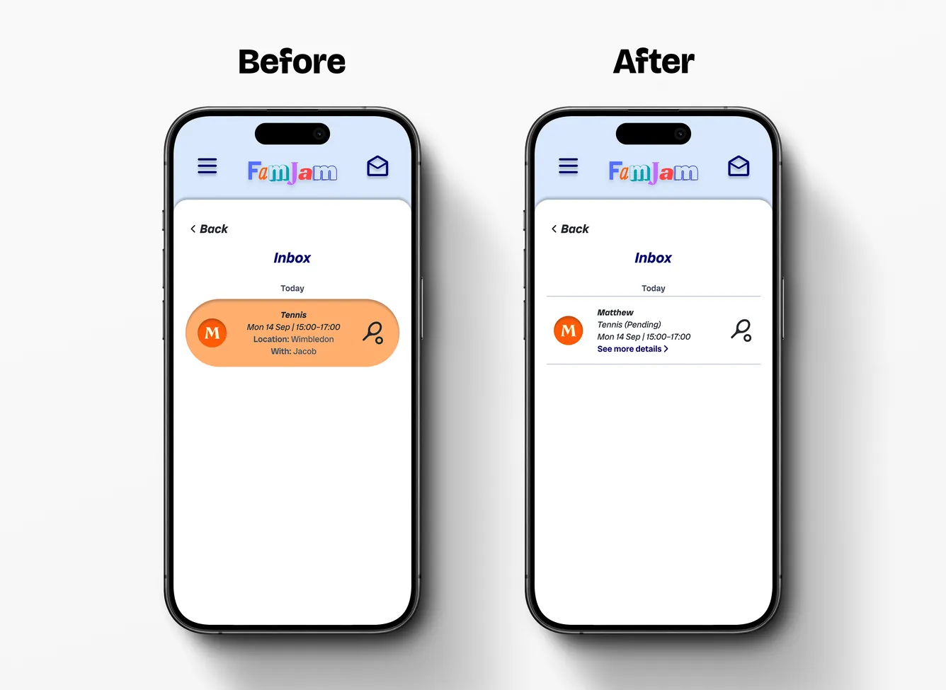
The inbox before and after round 2 testing.

Round 2 testing · High fidelity

The fixes worked, and two last snags

The same five people tested the high-fidelity prototype. The fixes worked, and two last snags came up: the invite option felt lost, and the pending inbox item didn’t look tappable. I fixed both. They knew me and had seen the app before, so I treat the scores as a strong signal, not proof.

97

Average SUS score

+100

Net Promoter Score

20/20

Tasks completed

06 · Skills shown

  • High-fidelity usability testing
  • System Usability Scale (SUS)
  • Net Promoter Score (NPS)
  • Task success and ease ratings
  • Iterating on findings
  • Being honest about bias
Read the full chapter : Round 2 testing · High fidelity
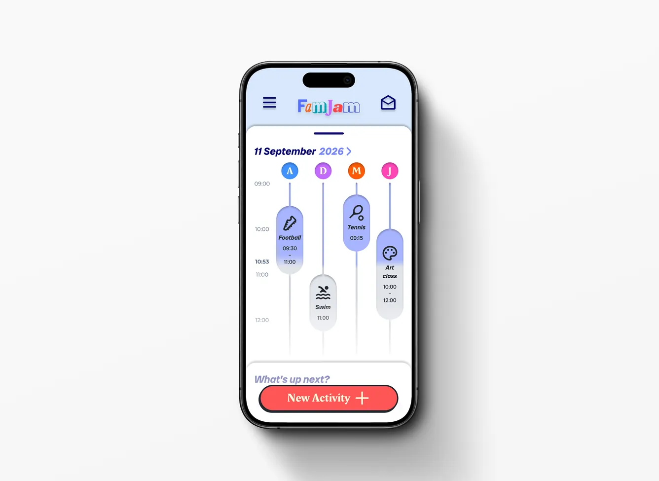
The final FamJam homepage timeline on a phone.

The final design

Answering Debby’s three problems

The finished prototype answers the three frustrations the project started with. Debby can see everyone’s day side by side. Anyone can add an activity, and she approves, reschedules or declines it. Reminders and a family leaderboard help the kids be ready on time, though the leaderboard is still to be tested.

3

Problems answered

5/5

Would recommend it

1

Feature still to test

07 · Skills shown

  • Solving the original problem
  • End-to-end user flows
  • Final interactive prototype
  • Designing for multiple users
Read the full chapter : The final design
Jacob smiling and holding up a phone with FamJam open.

Reflection

What I learned, and what’s next

The biggest surprise was how much I’d taken for granted, so I now treat “obvious” as something to test, not assume. Next time I’d use auto layout from the first wireframe. Next up: test the leaderboard with real families, test beyond my family, and check it with VoiceOver and TalkBack.

2

Rounds of testing

10

Test sessions run

6

Next steps planned

08 · Skills shown

  • Reflecting on my process
  • Planning the next research
  • Accessibility testing plan
  • Learning a new tool fast
Read the full chapter : Reflection
Next case study: FamJam design system 

How I built the 56-component system behind FamJam.