Case study 02 · Design system

FamJamdesign system

How I turned one family planner app into a set of reusable decisions: tokens, components and documentation, all built in Figma.

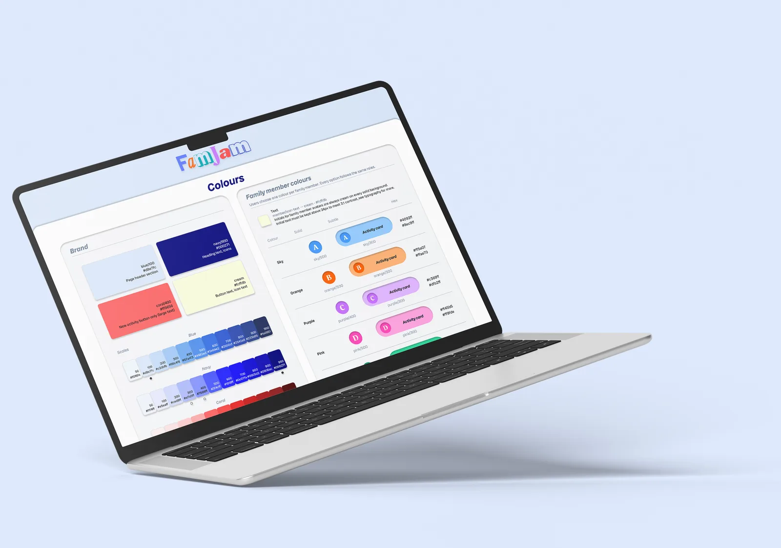
A laptop showing the Colours page of the FamJam design system.
Role
Sole designer
Timeline
Sep – Oct 2026
Tools
Figma variables, components, auto layout; Material Symbols
Context
Self-initiated, alongside the Google UX course
Back to work

Skim in about 3 minutes · 7 cards

At a glance

Why

A design system wasn’t part of the course. I built one to learn how good design is put together.

Constraints

Solo and new to design systems, learning with Claude as an expert tutor, alongside building the app itself.

Result

56components, 3 variable collections, 13 text styles and 100+ screen reader notes.

The project in seven steps

Seven steps · hover over a card to see the skills behind it

Seven steps · tap a card to see the skills behind it

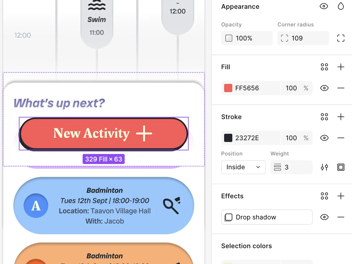
The New Activity button selected in Figma, with typed-in hex colours FF5656 and 23272E.

The starting point

A home screen with nothing reusable

FamJam’s first home screen was designed screen by screen. It looked finished, but nothing underneath was reusable: loose colours and spacing with many near-duplicates, one-off shadows, icons at mixed weights and sizes, and three typefaces with no type scale. Every change meant fixing layers by hand, so I wanted one source of truth.

3

Typefaces, no scale

1

Screen audited

01 · Skills shown

  • Auditing an existing design
  • Spotting inconsistency
  • Making the case for one source of truth
Read the full chapter : The starting point
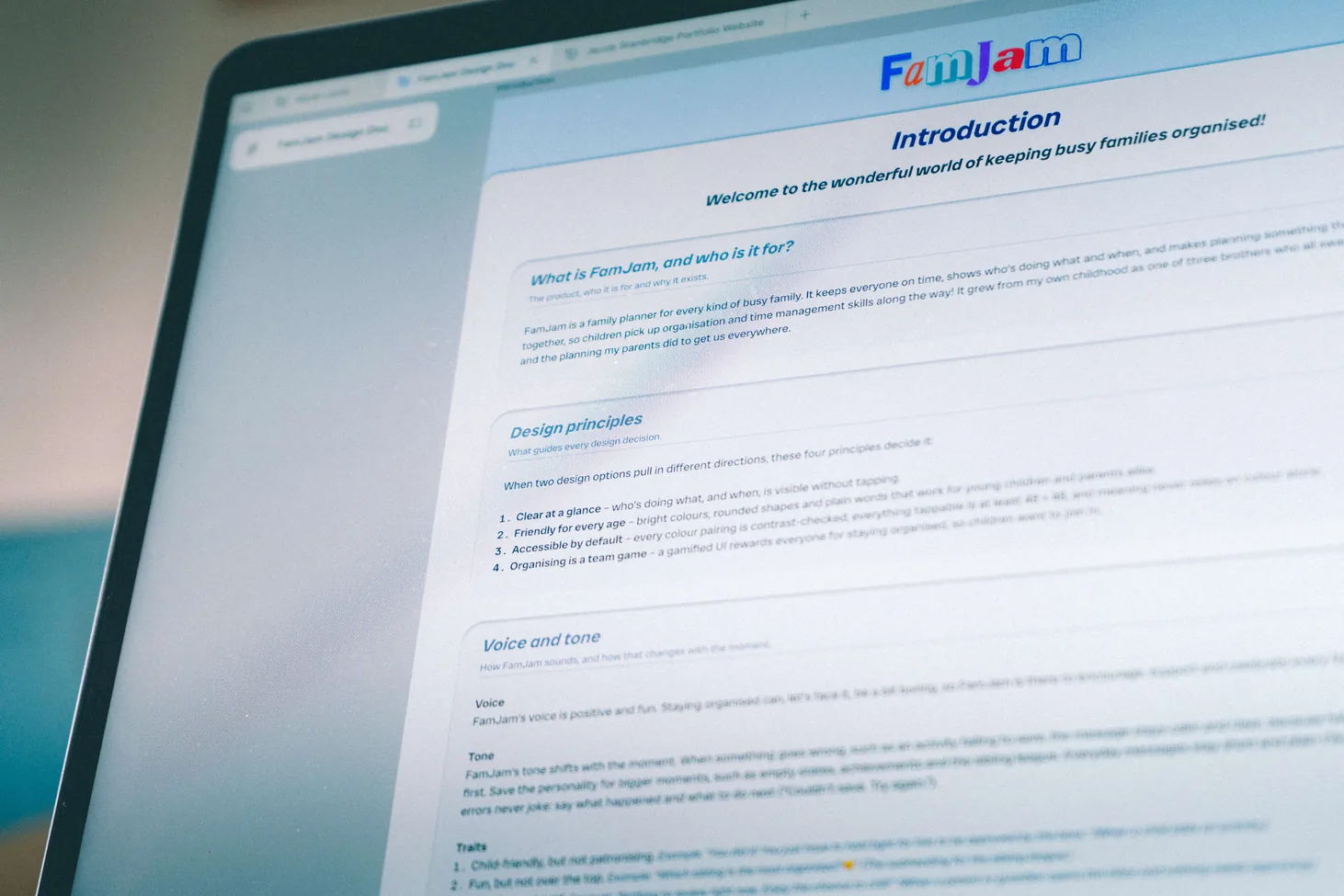
Close-up of the design system’s Introduction page on a laptop screen.

The approach

One section at a time

I built the system in nine sections, from colour to the sticker sheet. Most followed the same loop: audit what the home screen used, turn it into rules, then document the reasoning. A final check on 14 October tested it end to end. I learned with Claude as a tutor, but made the design decisions and built most of it myself, with repetitive jobs carried out by Claude.

9

Sections built

3

Steps in every loop

4

Design principles

02 · Skills shown

  • A repeatable process
  • Design principles
  • Design documentation
  • End-to-end system check
  • Scoping: finished, not perfect
  • Self-directed learning
Read the full chapter : The approach
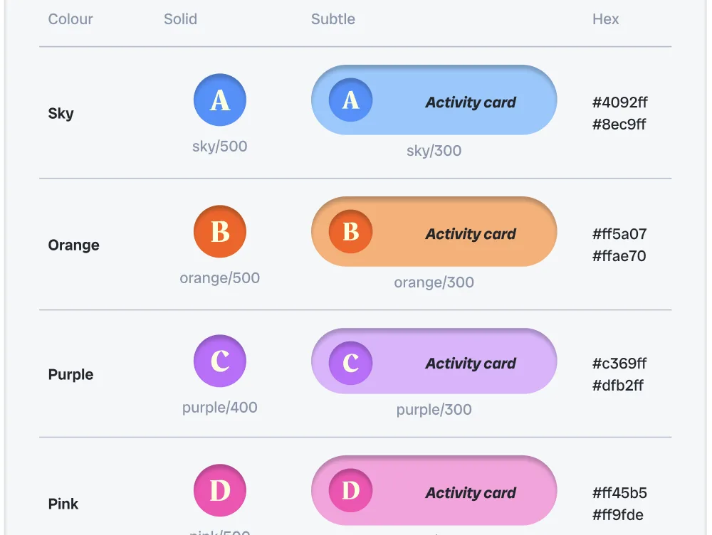
The member colours table: Sky, Orange, Purple and Pink, each with solid and subtle swatches, an activity card and hex values.

Foundations

Every value becomes a token

Tokens come in two layers: primitives say what values exist, and semantic roles say what they’re for. Change a role and everything using it follows. Eight family colours sit in one Member collection, so setting a mode recolours a whole component. Icons use one set with five fixed settings, and the logo has clear-space rules.

3

Variable collections

8

Family colour modes

13

Text styles

03 · Skills shown

  • Primitive and semantic tokens
  • Figma variables and modes
  • Type system
  • 8px spacing grid
  • Shadow styles
  • Icon guidelines
  • Logo guidelines
Read the full chapter : Foundations
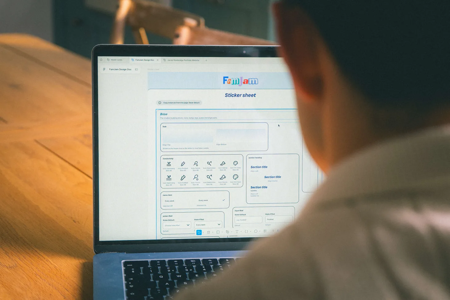
Over-the-shoulder view of the FamJam sticker sheet open in Figma on a laptop.

Components

Built bottom up, ready to hand over

The first version had 27 components in three levels: base parts, composites and whole sections. Building the prototype grew it to 56. Each property covers one decision and is named by its value, names map straight to code, and everything interactive has pressed and focus states and a 48 × 48 tap area. A sticker sheet shows them all in one place.

27 → 56

Components

3

Levels

48 × 48

Tap area on anything interactive

04 · Skills shown

  • Component structure (3 levels)
  • Variants and properties
  • Interaction states
  • Naming conventions
  • Developer handover in Dev Mode
  • Sticker sheet
Read the full chapter : Components
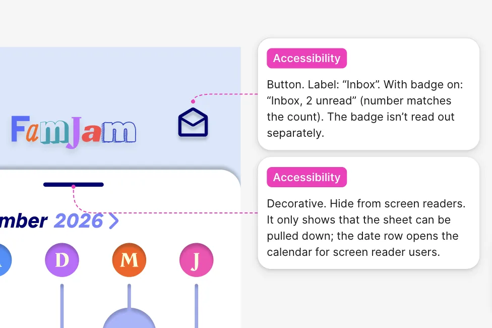
Part of the FamJam homepage with two accessibility annotations: the inbox button’s label and a decorative element.

Accessibility

Fixed once, inherited everywhere

Accessibility fixed screen by screen gets lost at the next change, so I fixed it in the components instead. Contrast was checked where things actually sit, text links got bigger tap areas, every screen has screen reader notes, and colour is never the only signal. One exception, the coral button, is documented on purpose.

2.0 → 3.2

Date arrow contrast

28 → 48

Link tap height, px

100+

Screen reader notes

05 · Skills shown

  • WCAG contrast checks
  • Touch target sizing
  • Screen reader annotations
  • Not relying on colour alone
  • Focus states
  • Documenting a trade-off
Read the full chapter : Accessibility

Putting it to work

The real test is new work

For the prototype I designed 26 new screens, then audited them against the system. Most of the fixes traced back to hand-drawn forms and buttons, so building those components solved about half. When testing found a problem, the 56th component fixed it the same day. Later, changing two tokens restyled every primary button.

26

New screens audited

73

Fixes found

2

Tokens to restyle the primary buttons

06 · Skills shown

  • Auditing new work
  • Responsive auto layout
  • Testing at 375, 393 and 430px
  • Prototype variables
  • Fast iteration from testing
  • Restyling with tokens
Read the full chapter : Putting it to work

Reflection

What I learned, and what’s next

The biggest surprise was how much of good design comes from structure, not only a creative eye. Next time I’d document as I go rather than afterwards. Some ideas didn’t survive, like amber buttons that failed contrast. Next up: dark mode, testing with VoiceOver and TalkBack, and publishing the library.

3

Ideas tried and dropped

5

Next steps planned

07 · Skills shown

  • Reflecting on my process
  • Knowing when to drop an idea
  • Planning next iterations
Read the full chapter : Reflection
Next case study: FamJam 

A family planner that isn’t a calendar.